When I visit a website on my phone, I expect it to load quickly, display readable content, and let me navigate without zooming or scrolling sideways. Most visitors expect the same experience. When a WordPress website fails on a smaller screen, readers may leave before exploring its products, services, or content.
Learning how to make WordPress mobile friendly involves more than installing a plugin or shrinking desktop elements. A dependable mobile experience requires a responsive theme, flexible layouts, optimized images, readable typography, simple navigation, accessible controls, and careful testing across devices.
Audit Your Current Mobile Experience
Before making changes, open the website on several phones and tablets. Check every important page, including the homepage, blog posts, service pages, contact page, forms, product pages, cart, and checkout.
Look for horizontal scrolling, overlapping sections, cropped images, tiny text, crowded buttons, broken menus, slow-loading banners, and pop-ups that cover the screen. Test both portrait and landscape orientations because layouts can behave differently when the device rotates.
Browser developer tools can simulate common screen sizes, but simulations should not replace real-device testing. Physical devices reveal problems involving touch controls, mobile browsers, keyboards, network speed, and screen brightness.
Choose a Responsive WordPress Theme

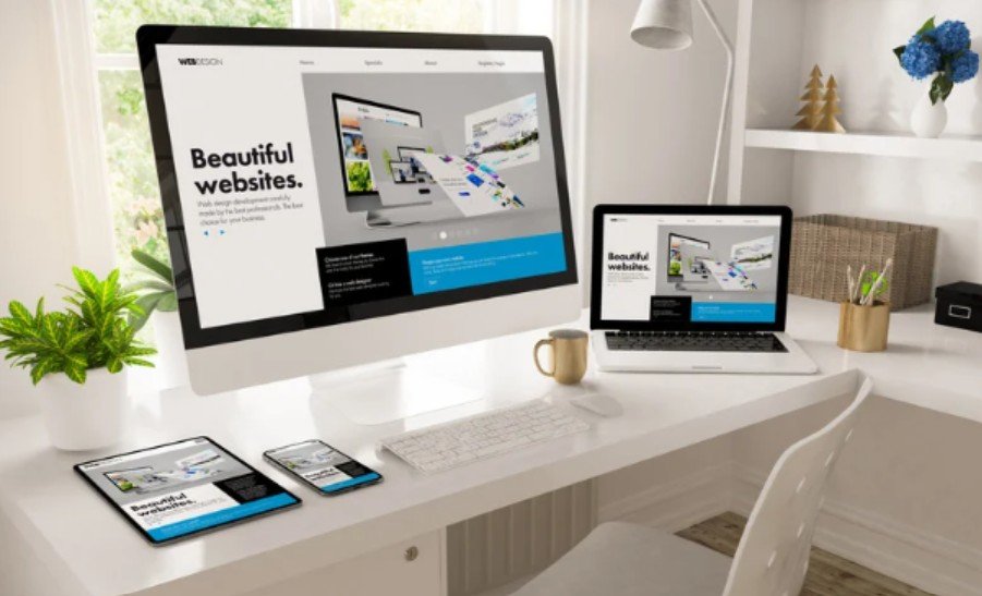
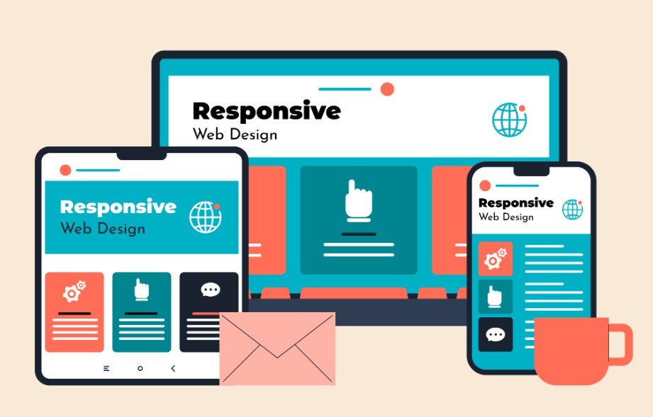
A responsive theme automatically adjusts its layout to different screen widths. Columns should stack naturally, images should scale correctly, and navigation should transform into a usable mobile menu.
Update the current theme before replacing it. An outdated version may contain responsiveness issues already corrected by its developer. If the theme remains difficult to use on mobile, test a modern alternative on a staging website.
Avoid changing themes directly on a live site. Switching themes can affect menus, different widgets, custom templates, page-builder settings, and styling. A staging environment allows you to identify these problems before visitors see them.
Adjust Layouts for Smaller Screens
Desktop layouts often use wide containers, several columns, large margins, and decorative elements. These choices can make mobile pages feel crowded.
Open the WordPress Site Editor, Customizer, or page builder and review device-specific settings. Reduce excessive margins and padding, stack columns vertically, and remove fixed widths that force content beyond the screen.
Do not hide essential information merely to create a cleaner mobile design. Device visibility settings should mainly remove decorative elements, repeated content, or features that provide little value on smaller screens.
Prevent Horizontal Scrolling
Horizontal scrolling commonly appears when an image, table, video, form, or container is wider than the viewport. Check elements with fixed pixel widths and replace them with flexible sizing where possible.
Long URLs, code snippets, and unbroken text can also force pages beyond the screen. Ensure these elements wrap properly rather than stretching the layout.
Simplify Mobile Navigation
Mobile visitors should be able to find important pages without opening several menus. Keep the main navigation short and group secondary links logically.
Use clear menu labels rather than vague terms. The mobile menu icon should be easy to recognize, and the opened menu should not cover important controls or become difficult to close.
A well-structured WordPress menu should remain easy to open, scan, and close on smaller screens, with clearly grouped links and enough spacing to prevent accidental taps.
Place essential actions, such as booking, calling, purchasing, or contacting the business, where users can reach them without excessive scrolling. However, avoid oversized sticky elements that occupy too much of the screen.
Optimize Images and Videos
Large media files can make mobile pages slow, especially on weaker connections. Resize images before uploading them and avoid using files significantly larger than their display dimensions.
Use modern image formats when they are supported, compress files, and enable responsive image delivery. WordPress can generate different image sizes, allowing browsers to select a suitable version for the visitor’s screen.
Lazy loading can delay off-screen images until they are needed. It is useful for long pages, but the main image near the top should load promptly rather than being unnecessarily delayed.
Videos and embedded maps should fit inside their containers. Avoid autoplaying background videos on mobile because they may consume data, increase loading time, and distract from the page’s purpose.
Improve Typography and Readability
Visitors should not need to zoom to read paragraphs. Use a comfortable base font size, sufficient line spacing, and strong contrast between text and its background.
Relative font units allow typography to scale more naturally across devices. Keep headings clearly different from body text, but avoid making them so large that only a few words fit on each line.
Short paragraphs improve scanning. Break long sections into meaningful headings and keep important instructions in live text instead of placing them inside images.
Make Buttons and Forms Touch-Friendly

Touch controls need enough size and spacing to prevent accidental taps. Avoid placing several small links close together, particularly in menus, filters, cookie notices, and checkout areas.
Forms should use a single-column layout on narrow screens. Labels must remain visible, error messages should explain what needs correction, and input fields should not extend beyond the viewport.
Use appropriate field types for phone numbers, email addresses, dates, and numbers. These settings can display more suitable mobile keyboards and make forms faster to complete.
Improve WordPress Mobile Speed
Mobile responsiveness and mobile performance are closely connected. A page can technically fit the screen while still delivering a poor experience because it loads slowly or shifts while visitors interact with it.
Remove unnecessary plugins, scripts, animations, sliders, and third-party widgets. Use caching, optimize fonts, reduce unused CSS and JavaScript, and choose dependable hosting.
Mobile performance also depends heavily on hosting quality, so businesses should understand how to choose web hosting for a local business website with reliable uptime, sufficient resources, fast servers, and responsive technical support.
Pay special attention to the largest visible element, unexpected layout movement, and delays after a user taps a control. Stable dimensions for images, banners, advertisements, and embedded content can reduce disruptive movement.
Check Page-Builder Responsive Settings

Popular page builders usually provide separate controls for desktop, tablet, and mobile layouts. Review column widths, font sizes, margins, padding, alignment, visibility, and element order at each breakpoint.
Avoid correcting every issue with negative margins or excessive custom CSS. These quick fixes may work on one phone while breaking another. Start with the builder’s responsive controls and use carefully scoped CSS only when necessary.
Test Every Important Page
After making changes, test the website with browser device previews, performance tools, and real phones. Review multiple screen sizes rather than testing only one popular device.
Check navigation, buttons, forms, pop-ups, cookie banners, embedded media, search tools, and interactive features. Ecommerce websites should also test product galleries, filters, variation selectors, carts, payment fields, and confirmation pages.
Repeat mobile testing after major theme, plugin, builder, or WordPress updates. A website that works correctly today can develop new layout problems after software changes.
Frequently Asked Questions
1. How can I tell whether my WordPress site is mobile-friendly?
Open important pages on different phones, test portrait and landscape modes, and look for unreadable text, horizontal scrolling, difficult navigation, crowded controls, and slow-loading elements.
2. Can a plugin make my WordPress website responsive?
A plugin may improve specific areas such as caching, images, menus, or forms. However, it cannot always repair an outdated or poorly coded theme. Correct the theme and layout settings before adding another plugin.
3. How to Make WordPress Mobile Friendly without coding?
Choose a responsive theme, use WordPress or page-builder mobile controls, optimize images, simplify navigation, adjust typography, improve forms, reduce unnecessary features, and test the results on real devices.
4. Does mobile optimization help search visibility?
A fast, accessible, and easy-to-use mobile experience can support engagement and search performance. It also reduces the likelihood that visitors will leave because the content is difficult to read or navigate.
Final Thoughts
I treat mobile optimization as an ongoing part of website maintenance rather than a one-time design task. Themes, plugins, content, browsers, and visitor expectations continue to change, so regular testing remains essential.
The most reliable process is to audit the existing experience, correct the theme and layout, optimize media and performance, improve accessibility, and verify every change on real devices. When each element works together, a WordPress site becomes faster, clearer, and easier for visitors to use on any screen.