I have visited many websites that looked attractive at first glance but became exhausting after a few minutes of reading. Tiny letters, weak contrast, tightly packed lines, and decorative typefaces can quickly push visitors away. Learning how to improve website font readability helps create pages that feel comfortable, accessible, and easier to understand on every screen.
Readable typography is not simply about selecting a popular font. Font size, character shape, line spacing, text width, contrast, alignment, and responsive behaviour all affect how comfortably people can process content. The following practical improvements can make website text clearer without sacrificing visual identity.
Why Website Font Readability Matters
Visitors often scan a page before deciding whether to read it. When headings, paragraphs, links, and buttons are visually clear, people can locate information faster and remain engaged for longer.
Poor typography may cause readers to lose their place, misread characters, skip important information, or leave the page. These problems can be especially difficult for people with low vision, dyslexia, age-related vision changes, or temporary visual fatigue.
Readable text can support:
- Better content comprehension
- Longer page engagement
- Easier website navigation
- Stronger accessibility
- Improved mobile usability
- Clearer calls to action
- Greater trust in the website
Typography also influences perceived quality. A consistent, carefully spaced page generally feels more professional than one using several competing fonts and irregular text styles.
1. Choose a Familiar, Legible Typeface

A body font should make individual letters easy to distinguish. Familiar typefaces usually require less effort to process because readers already recognise their shapes.
Look closely at characters that are commonly confused, including uppercase I, lowercase l, the number 1, uppercase O, and the number 0. A typeface may look stylish in a heading but perform poorly in long paragraphs if its characters are too similar.
Decorative, handwritten, condensed, or highly stylised fonts should generally be reserved for short headings or branding elements. They rarely provide comfortable reading across several paragraphs.
2. Use a Comfortable Body Font Size
There is no single font size that works perfectly for every typeface, device, and audience. However, approximately 16 to 18 pixels is a practical starting range for ordinary body text.
A font with a small x-height may need to be larger than another font set at the same numerical size. Instead of relying only on the value in a design tool, examine how the text actually appears on desktop and mobile screens.
Important content should not require visitors to zoom before they can read it.
3. Give Each Line Enough Vertical Space
Line height controls the vertical distance between lines of text. When lines are packed too closely, paragraphs can appear dense and readers may struggle to move accurately from one line to the next.
A line-height value between 1.4 and 1.6 often provides a useful starting point for body copy. The best setting depends on the font, its size, and the width of the content column.
Too much spacing can also reduce readability by making related lines feel disconnected. Aim for enough separation to guide the eye without breaking the paragraph’s visual unity, so understanding text spacing is must.
4. Control the Width of Text Columns

Very long lines force the eyes to travel across a wide area and make it harder to locate the beginning of the next line. Extremely short lines interrupt reading with frequent line breaks.
For long-form content, a measure of approximately 50 to 80 characters per line is usually comfortable. This can be achieved by limiting the maximum width of the main content area rather than stretching paragraphs across the entire screen.
Text-column width should be tested at several browser sizes because responsive layouts can change line length significantly.
5. Increase Text and Background Contrast
Text must remain clearly visible against its background. Light-grey lettering on a white background may create a minimalist appearance, but it often becomes difficult to read in bright environments or on lower-quality screens.
Use a reliable contrast-checking tool instead of judging colours only by sight. Check body text, headings, navigation labels, links, buttons, form instructions, error messages, and placeholder text.
Avoid placing paragraphs directly over detailed photographs unless a solid overlay or background panel creates dependable contrast.
6. Create a Clear Typography Hierarchy
Readers should be able to distinguish the page title, main sections, subsections, body paragraphs, captions, and calls to action immediately.
Use a consistent heading hierarchy rather than changing font sizes randomly. The H1 should introduce the page topic, H2 headings should divide major sections, and H3 headings should organise supporting information within those sections.
Size, weight, spacing, and position can establish hierarchy without introducing several unrelated typefaces.
7. Limit the Number of Fonts

Using too many fonts can make a page look inconsistent and increase loading demands. One typeface may be enough for the entire website when its available weights and styles create sufficient distinction.
A two-font system can also work well, with one font for headings and another for body text. Both fonts should complement each other and remain clear at their intended sizes.
Avoid loading multiple weights that are never used. A smaller, intentional font system can improve visual consistency and performance.
8. Use Font Weight Carefully
Thin font weights can disappear against bright backgrounds or become difficult to read on some screens. Standard or medium weights are generally safer for body text.
Bold text should be used selectively to draw attention to genuinely important information. When entire paragraphs are bold, emphasis loses its purpose and the page becomes visually heavy.
Check whether links, buttons, and active navigation states remain distinguishable without depending only on subtle weight changes.
9. Avoid Excessive Capitals and Italics
Words written in all capital letters create a more uniform visual shape, which can slow recognition in longer passages. Reserve capitals for short labels, small navigation elements, brief emphasis, or clearly structured website navigation.
Italic text can also become harder to process when used across several sentences. It works better for occasional titles, terms, or restrained emphasis than for essential instructions or full paragraphs.
10. Keep Long Paragraphs Left Aligned

Left-aligned text gives every line a consistent starting point, helping readers track their position. Centred text can work for short headings or brief promotional statements but becomes tiring in longer sections.
Fully justified text may produce uneven gaps between words, particularly on narrow screens. These gaps can interrupt the natural reading rhythm and create distracting visual patterns.
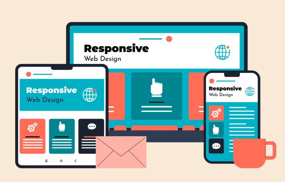
11. Use Scalable and Responsive Typography
Website visitors should be able to enlarge text without losing content or functionality. Relative units such as rem can help typography respond more predictably to browser preferences.
Test the page at increased zoom levels. Text should resize without overlapping images, disappearing inside containers, covering buttons, or forcing excessive horizontal scrolling.
Responsive typography should also account for smaller screens. Mobile text must remain readable without requiring pinching or repeated zooming.
12. Test Readability on Real Devices
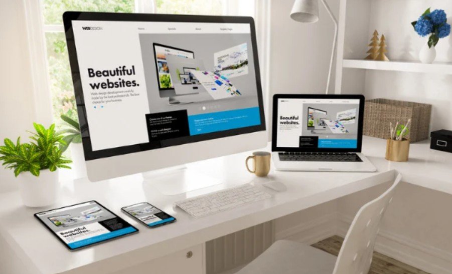
Typography that looks excellent in a design preview may behave differently in a browser. Test the website on phones, tablets, laptops, and larger monitors.
Review it under different conditions, including bright light, low screen brightness, and increased browser zoom. Check difficult character combinations such as Il1, O0, rn, and cl.
Testing should also include comment forms and discussion areas, especially on busy blogs. Reviewing how to stop spam comments in WordPress can help prevent cluttered, suspicious, or repetitive submissions from making otherwise readable pages feel untrustworthy and difficult to manage.
Automated tools can identify contrast and resizing problems, but human testing remains essential. Ask people to read a section, find information, complete a form, and explain where the experience becomes uncomfortable.
Testing should also include form labels, instructions, confirmation messages, and error text. Following guidance on how to prevent website contact forms from going to spam can help ensure readable, accessible forms also deliver legitimate submissions reliably.
Frequently Asked Questions
1. How to improve website font readability for mobile users?
Use a comfortable font size, strong contrast, responsive units, sufficient line spacing, short text columns, and layouts that remain functional when text is enlarged.
2. What font size is easiest to read on a website?
A body size around 16 to 18 pixels is a practical starting point, although the ideal size depends on the typeface, screen, content, and intended audience.
3. Are sans-serif fonts always easier to read online?
No. Both serif and sans-serif fonts can work effectively when they have familiar shapes, distinguishable characters, suitable spacing, and an appropriate size.
4. How can I test website typography accessibility?
Check colour contrast, enlarge text to 200%, test keyboard and mobile use, inspect ambiguous characters, and ask real users to complete typical reading tasks.
Final Thoughts
I believe the best typography is the kind readers barely notice. It supports the content quietly, allowing people to understand information without fighting small letters, cramped spacing, poor contrast, or confusing character shapes.
I would begin with the body text because it carries most of the reading experience. From there, I would review line height, column width, contrast, hierarchy, mobile behaviour, and zoom support. Regular testing across real devices can reveal issues that design previews miss and help create a clearer, more welcoming website for every visitor.