
Designing ecommerce layouts over the years taught one hard lesson: driving traffic means nothing if your landing interface fails at the finish line. Every single element on a product screen either pushes a customer toward checkout or quietly nudges them away.
Building an effective product detail page web design requires blending smart conversion rate optimization with clean, functional aesthetics. When layout strategy, visual clarity, and responsive interaction align, store visitors turn into confident buyers.
Key Takeaways
- High-converting product pages pair high-contrast buttons with clear visual layout hierarchies.
- Dynamic variant swatches and interactive micro-interactions lower return rates and build customer confidence.
- Above the fold layout optimization directly impacts mobile conversion rates across ecommerce stores.
- Mobile-first responsive design requires sticky checkout bars and fast loading media elements.
- Clear visual proof elements reduce buyer hesitation right at the final point of purchase.
Why Product Detail Page Web Design Matters

Think of your product layout as a friendly retail clerk who never sleeps. Excellent product detail page web design instantly tells shoppers what an item is, why they need it, and how quickly it can arrive at their door. Without smart design choices, even the best products get ignored.
When you polish your layout, you turn passive visual scrolling into active cart building. A well-designed page removes buying friction, builds instant trust, and turns casual browsers into happy paying customers.
Key Design Elements for Maximum Conversions
Strong visual structure forms the backbone of any successful online product screen.
High-Resolution Media and Dynamic Visuals
Showcasing products from various angles builds instant buying confidence. Use four to six crisp, high-resolution images or contextual video demonstrations that highlight textures, materials, and real-world scale.
Including interactive zoom capabilities and 360-degree views bridges the gap between digital shopping and brick-and-mortar touch. Showing items in real-world scenarios helps customers visualize ownership effortlessly.
Instant Social Proof and Ratings
Positioning star ratings right beside product titles validates quality early. Place review counts and direct links to customer feedback near the top to build immediate trust before the user scrolls.
Verified customer photos and genuine ratings reassure skeptical buyers. Highlighting real experiences reduces hesitation and validates the product value immediately.
Intuitive Selection Controls
Making color, size, and quantity selectors easy to tap prevents user frustration. Replace clunky dropdown menus with visible swatches or button tiles that update primary images in real time.
Ensuring selectors respond instantly on both desktop and mobile screens keeps the experience smooth. Clear feedback during selection prevents ordering errors and keeps shopping fun.
Shipping Details and Smart Urgency
Clearly stating shipping times and return policies right near the purchase area removes lingering doubts. Displaying transparent delivery dates gives buyers total confidence in their order timeline.
Adding subtle inventory alerts like low stock indicators creates helpful urgency. Highlighting limited quantities encourages shoppers to take action instead of leaving items in abandoned carts.
Best Practices for Layout Optimization

Design choices should always prioritize speed and effortless navigation to keep visitors engaged.
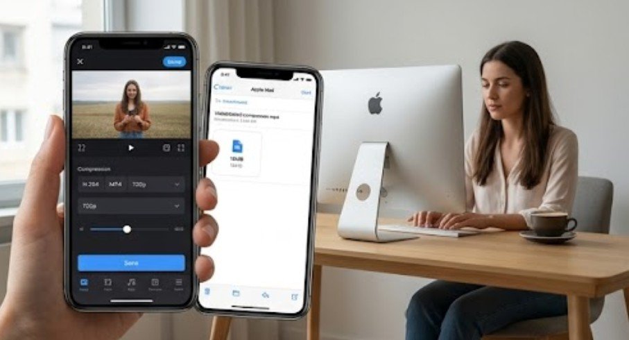
Stores that provide downloadable manuals, catalogs, or sizing guides should also understand how to compress large PDF files without losing quality so supporting documents load quickly without making diagrams or product details difficult to read.
One Primary Call to Action Button
Avoid decision fatigue by styling your main purchase button as the undisputed hero of the page. Use a bold, high-contrast color that pops from the background so eyes naturally gravitate toward it.
Keep secondary buttons like wishlists or social shares muted in comparison. A single clear action path prevents confusion and speeds up the checkout process.
Scannable Descriptions and Accordions
Keep top descriptions brief and benefit-driven to capture immediate interest. Group technical specifications, sizing charts, and care instructions below the fold or inside neat collapsible accordions.
Organizing secondary content into expandable panels keeps the main layout tidy. Interested buyers can dive deep into details without feeling overwhelmed by walls of text.
Strategic Trust Badges
Place secure payment icons and money-back guarantee badges directly below the primary purchase button. Visual safety signals reassure shoppers that their payment information remains safe.
Combining security logos with clear warranty promises minimizes final checkout anxiety. Small trust markers often provide the final push a buyer needs to complete an order.
Actionable Tips for Product Detail Page Web Design
- Start by creating a clean grid structure that separates media galleries on the left from product controls on the right for desktop displays. Place your primary product title at the top, followed immediately by star ratings and dynamic pricing displays.
- When planning layouts with generative tools, a structured AI web design prompt can help define the product gallery, pricing hierarchy, variant controls, trust signals, and mobile behavior before development begins.
- Next, implement visual variant selectors using custom radio buttons styled as color swatches or size boxes. Wire these interactive controls to swap the main gallery image dynamically whenever a user clicks a new option.
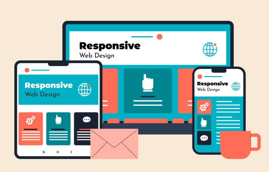
- Finally, place your prominent buy button directly below the variant controls with security badges underneath. Organize detailed descriptions, sizing guides, and care instructions into collapsible accordion panels, ensuring the primary purchase button stays fixed to the bottom edge on mobile screens.
Frequently Asked Questions
1. What is a product detail page?
A product detail page is an ecommerce web page presenting specific item information like photos, descriptions, pricing, and specs. It guides shoppers toward making an informed purchase decision through interactive controls, visual proof, and clear checkout action buttons.
2. How to create a product detail page?
Build pages by setting up structured visual grids that separate media galleries from purchase controls. Incorporate your main product detail page web design strategy by adding high-resolution media, clear typography, dynamic variant swatches, social proof, and high-contrast action buttons.
3. What are the 7 C’s of web design?
The 7 C’s of web design stand for Context, Content, Community, Customization, Communication, Connection, and Commerce. Together, these core design pillars create user-centered websites that balance visual aesthetics, clear brand messaging, and conversion goals seamlessly.
4. What is the 3 second rule in web design?
The 3-second rule states that websites must load content and communicate core value within 3 seconds. Failing to engage users in this critical window leads to high bounce rates, as visitors abandon slow or confusing screens.
The Final Finish Line for Better Page Conversions
Mastering product detail page web design comes down to removing friction and presenting value clearly. By combining high-resolution visuals, clear action buttons, strategic trust badges, and responsive layouts, you create digital shopping experiences that convert visitors consistently. Start auditing your store layouts today to build cleaner, faster, and more profitable product pages!