Designing client projects over the years taught us that typography makes or breaks a digital layout. Knowing how to choose typography for websites transforms static text into an engaging visual journey for every site visitor. We have seen firsthand how the right fonts build trust, guide eyes smoothly down the screen, and dramatically improve site conversions.
Key Takeaways
- First, stick to a maximum of two font families to keep layouts clean.
- Second, set body text to at least 16 pixels for effortless reading.
- Third, maintain strong line height between 1.4 and 1.6 for paragraph copy.
- Fourth, verify color contrast passes WCAG accessibility standards before going live.
- Fifth, leverage variable fonts to boost web page load speeds significantly.
Define Your Brand Personality
Setting up typography begins with understanding the core identity of the brand.
Modern and Minimalist Styles
If your project demands a clean, modern vibe, stick to geometric sans-serif typefaces like Montserrat or Poppins. These fonts strip away extra decoration, creating a sleek digital aesthetic that feels fresh and accessible on every device screen.
Traditional and Trustworthy Tones
When building authority for businesses that are traditional like law firms or financial institutions, use reliable serifs like Playfair Display or Libre Baskerville. These letterforms carry centuries of editorial history, helping your brand project instant credibility and elegance.
Tech and Engineering Aesthetic
For SaaS platforms, coding tools, or technical dashboards, opt for monospace or neo-grotesque typefaces like Roboto Mono or Open Sans. They offer precise letter spacing and utilitarian structure, giving your user interface a precise, modern engineering feel.
Prioritize Web Legibility

Building readable websites requires treating typography as both an art form and a technical science.
Choosing Open Apertures for Small Screens
Fonts with open apertures feature wide openings inside letterforms like lowercase ‘c’ or ‘a’, rendering sharply on low-resolution displays. Selecting web fonts with generous internal counters prevents individual letters from blurring together when text scales down on mobile viewports.
Verifying High Contrast Ratios
Poor color contrast ruins great typographic layout faster than almost anything else. Verify that your text color contrast against the background passes Web Content Accessibility Guidelines by checking ratios on tools like Color Contrast.
Ensuring Scalability and Mobile Rendering
Always choose scalable type families that load efficiently through trusted resources like Google Fonts. Testing font performance across desktop monitors, mobile devices, and tablet browsers ensures crisp legibility everywhere without sacrificing site performance.
Typography should also remain usable for visitors who rely on a keyboard. Learning how to test keyboard navigation for website accessibility helps you verify that links, buttons, menus, and form controls have clear focus states and follow a logical tab order.
Master Font Pairing
Creating seamless visual organization relies on clear typographic structure across your pages.
The Safe Method Using Single Font Families
The easiest way to pair fonts safely is sticking to a single, deep font family like Roboto or Open Sans. You build instant visual contrast simply by adjusting weights, using bold styles for high-impact headlines and regular weights for continuous body copy.
The Contrast Method for Dynamic Layouts
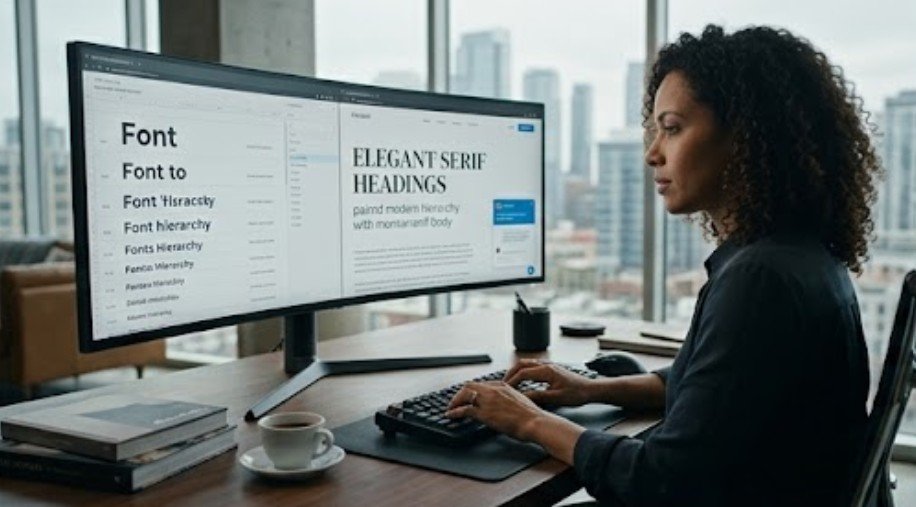
For more expressive pages, pair a distinct display font for headings with a neutral, invisible sans-serif font for body text. Utilizing interactive generators like Fontjoy helps discover complementary font pairings that harmonize perfectly without cluttering your design layout.
Limiting Font Families for Speed
Choose two to three fonts maximum to maintain visual order and fast performance. Combine one highly readable sans-serif like Inter for body copy with an expressive serif for headlines, keeping file sizes lightweight and page load times lighting fast.
Establish a Clear Typographic Scale

Setting up proportional sizing builds an intuitive reading hierarchy across your website layout.
Typography also shapes what is above the fold by determining how much of the headline, supporting copy, and call to action remains visible before visitors scroll.
Sizing Body Copy and Line Height
Keep your base body text size set to at least 16 pixels so users read without straining their eyes. Set your line-height between 1.4 and 1.6 times the font size, giving every paragraph room to breathe across wide desktop screens.
Scaling Headings for Maximum Impact
Headings should command immediate visual attention as users scroll down your pages. Apply a distinct mathematical scaling system, such as multiplying base sizes by 1.618 (the Golden Ratio), to generate clear visual hierarchy from H1 tags down to H3 elements.
Responsive Font Sizing with Clamp
Static pixel sizes often fail when layouts transition from desktop monitors down to mobile viewports. Using the CSS clamp function allows your typographic scale to scale fluidly based on viewport width, preserving ideal reading proportions on every screen size.
How to Choose Typography for Websites Step by Step

- Starting your typographic selection process requires a systematic, practical workflow. We begin by auditing the brand personality and mapping out clear project goals before looking at any font libraries.
- Next, select one highly readable sans-serif font for body copy and pair it with an expressive headline typeface. Test these fonts inside interactive wireframes to verify letterform clarity, checking tricky characters like uppercase I, lowercase L, and numbers side by side.
- Then, configure a responsive type scale using modular ratios to establish consistent vertical rhythm. Set your base body size to 16 pixels with a generous 1.5 line height, ensuring text blocks feel spacious and comfortable for long reading sessions.
- Finally, run thorough accessibility and performance tests across multiple mobile and desktop browsers. Verify your contrast ratios exceed WCAG standards, compress files into WOFF2 formats via Google Fonts, and limit total font weights to keep your site running at peak speed.
Frequently Asked Questions
1. How to choose typography for websites without making design mistakes?
To learn how to choose typography for websites, pick two complementary fonts, set body text to 16 pixels, maintain strong contrast ratios, and test readability across various mobile screen sizes.
2. What is the best baseline font size for web body text?
The standard baseline font size for web body copy is 16 pixels. This size delivers optimal legibility across desktop screens and mobile devices without requiring user zoom adjustments.
3. How many total font families should a web project use?
Limit your web project to two font families at most. Using one font for headlines and another for body copy maintains visual harmony while preventing slow page loading speeds.
4. Why are Google Fonts ideal for responsive web design?
Google Fonts provides free, open-source typefaces optimized for web performance. They render clearly on mobile screens, support variable font technology, and host reliable font files globally.
Font-Tastic Rules: Your Path to Typography Mastery
Mastering how to choose typography for websites elevates your web design projects from basic to breathtaking. By pairing expressive headline fonts with readable body text, setting modular scales, and meeting WCAG accessibility standards, you build digital experiences users love. Apply these practical font rules today to transform your site layout, boost visitor engagement, and deliver polished web design projects every time.