
A stylish website loses its value when visitors must squint, zoom, or search for basic information. When I consider how to improve website readability for older adults, I focus on removing unnecessary effort from every interaction.
Larger text, stronger contrast, comfortable spacing, clear writing, and predictable navigation can turn a frustrating website into a welcoming experience—without making the design feel outdated or overly simple.
What Font Size Makes a Website Easier for Older Adults to Read?
I recommend starting body copy between 16 and 19 pixels, depending on the typeface and audience. A 16-pixel font can work well when it has open letterforms and generous spacing, while some designs may need 18 or 19 pixels for comfortable reading. These typography choices are also important when explaining how to write accessible form error messages, as instructions and corrections must remain clear and easy to read.
Font size alone does not determine readability. Two fonts at the same size can look different because of their character width, height, and stroke design. Clean, familiar typefaces such as Arial, Calibri, Verdana, Tahoma, and Helvetica are generally dependable choices. Decorative, condensed, and script fonts should be reserved for limited design accents.
A line height between 130% and 150% of the body font size helps prevent rows from appearing crowded. I also limit most text lines to approximately 50 to 75 characters. Extremely wide paragraphs make it harder for readers to locate the beginning of the next line.
Body text should remain left-aligned. Centered paragraphs create an inconsistent starting point, while fully justified text can produce distracting spaces between words. I avoid long passages in italics, excessive bold styling, and blocks written in all capital letters because they reduce familiar differences between word shapes.
What Color Contrast Ratio Should a Senior-Friendly Website Use?

WCAG Level AA calls for a contrast ratio of at least 4.5:1 for normal text and 3:1 for qualifying large text. For websites serving many people with low vision, I consider the stronger 7:1 Level AAA ratio whenever the design allows it.
Dark text on a clean, light background is usually a dependable choice. Text placed over photographs, videos, gradients, or patterned backgrounds can become difficult to distinguish. When copy must appear over an image, a solid or sufficiently opaque background should maintain consistent contrast behind every word.
Color should not communicate information by itself. For example, a form cannot identify an error only by changing a field border to red. The design should add a clear written message and another recognizable indicator.
Links within paragraphs should use both a noticeable color difference and underlining. This approach makes them easier to identify for people with reduced color perception. Non-link text should not be underlined because visitors may mistake it for a clickable element.
How Can Spacing and Page Structure Reduce Visual Overload?
White space gives readers room to separate related information. I leave clear gaps between paragraphs, headings, images, buttons, form fields, and content sections. However, related labels and controls should remain close enough to show that they belong together.
A narrow, uncluttered content area is usually easier to follow than a page filled with competing sidebars, advertisements, animations, and promotional cards. Important information should appear early, while secondary content can follow in clearly labeled sections.
Every page also needs a logical heading hierarchy. The H1 introduces the page topic, H2 headings divide the main subjects, and H3 headings explain details within each subject. Heading levels should follow a meaningful sequence instead of being selected only for their visual size. This structure helps readers scan the page and supports people using screen readers.
How Should Navigation and Interactive Elements Be Designed?
Predictable navigation reduces memory demands and helps users understand where they are. I favor familiar labels such as Services, About, Resources, and Contact instead of clever phrases that require interpretation. The main navigation should remain consistent across pages, and essential information should not sit inside several layers of dropdown menus.
Complex hover menus can be especially frustrating for users with tremors or reduced pointer accuracy. Menus should open intentionally, remain available long enough to use, and work with a keyboard. Breadcrumbs and a visible search function can provide additional ways to find information.
Buttons, form fields, menus, and other clickable targets need large dimensions and generous spacing. Although WCAG 2.2 establishes a 24-by-24 CSS-pixel minimum target-size requirement in many situations, controls closer to 44 by 44 pixels are often more comfortable on touchscreens.
Standard actions should work with one click or tap. I avoid interactions that depend on rapid double-clicking, dragging, precise hovering, or complicated gestures. Every action should also produce visible feedback so users know whether the website received their request.
How Can Browser Zoom and Mobile Design Improve Accessibility?

Users should be able to resize text to 200% without losing content or functionality. Enlarged words must not overlap, disappear, become clipped, or force unnecessary horizontal scrolling. Visible text-size controls may also help visitors who are unfamiliar with browser zoom.
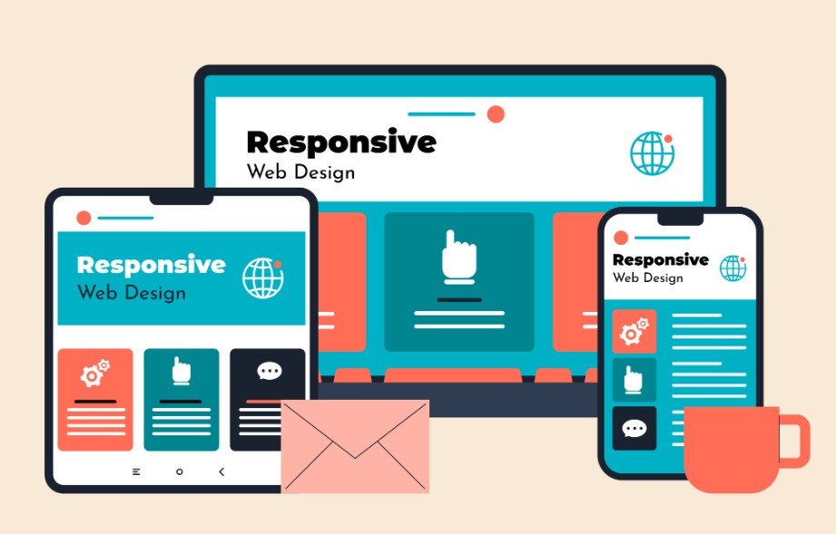
Responsive design should maintain readable text and usable controls on smartphones and tablets. I test portrait and landscape orientations, menus, forms, images, pop-ups, and sticky banners. Mobile visitors should not need to pinch the screen simply to read ordinary body copy.
How Does Plain Language Improve Digital Accessibility?
Visual presentation cannot rescue confusing writing. I use concise sentences, familiar words, descriptive headings, and short paragraphs. Fifteen words is a useful target for many sentences, but clarity matters more than enforcing a rigid limit.
Technical terms should appear only when necessary and should be defined when first introduced. Instructions need to follow the order in which users perform each action. When a procedure contains several stages, clearly numbered steps are easier to follow than one dense paragraph.
Descriptive link text also provides better context than phrases such as “click here.” A label such as “Review the accessible forms guide” tells readers what will happen before they select the link.
How Should Forms and Multimedia Support Older Users?
Form labels should remain visible after users begin typing. Instructions should appear before they are needed, and required fields must be clearly identified. When an error occurs, the message should name the affected field, explain the problem, and describe how to correct it. Previously entered information should remain available so users do not have to restart.
Images need meaningful alternative text when they communicate information. Videos should include accurate synchronized captions, while audio-only material should provide complete transcripts. These alternatives support people experiencing age-related hearing or vision changes.
Animations, auto-playing videos, rotating carousels, and flashing graphics can interrupt concentration. Users should be able to pause, stop, or hide moving content. Important instructions should never disappear before someone has enough time to read them.
How Can I Test a Website With Older Users?

I begin by checking contrast, heading order, alternative text, form labels, and keyboard access. I then enlarge the page to 200%, review it on multiple screen sizes, and confirm that visible keyboard focus indicators remain available.
Automated accessibility tools can detect many technical problems, but they cannot determine whether a page feels understandable. I ask adults aged 65 and older to complete realistic tasks, such as locating a phone number, scheduling an appointment, reading a policy, or correcting a form error. Their pauses, mistakes, and repeated actions often reveal barriers that automated reports miss.
Frequently Asked Questions (FAQs)
1. How can I learn how to improve website readability for older adults?
Begin with 16-to-19-pixel text, adequate line spacing, strong color contrast, simple language, predictable navigation, large controls, accessible multimedia, and support for 200% resizing. Complete the process by testing real tasks with older users.
2. Are sans-serif fonts always best for senior-friendly websites?
Not always, but familiar sans-serif fonts often work well on screens because they have simple, open letterforms. Font size, spacing, contrast, character distinction, and user testing matter more than the font category alone.
3. Does an accessible website need a 7:1 contrast ratio?
WCAG Level AA generally requires 4.5:1 for normal text. A 7:1 ratio meets the stronger Level AAA requirement for normal text and may provide greater clarity for visitors with reduced contrast sensitivity.
4. Does WCAG compliance guarantee good readability?
No. Technical compliance provides an essential foundation, but it cannot guarantee clear language or effortless navigation. Content reviews and usability testing with older adults remain necessary.
A Clearer Path Forward
I view accessible readability as a practical expression of respect. Older visitors should not have to fight faint text, dense paragraphs, confusing menus, tiny buttons, or disappearing instructions to use an essential service.
By combining flexible typography, strong contrast, plain language, stable layouts, accessible controls, useful media alternatives, and real-user testing, I can create a website that feels clearer and more trustworthy. These improvements support older Americans while making the experience better for almost everyone.