
A new visitor should not need detective skills to understand your website. If the purpose, path, or next action feels unclear, people may leave before seeing your best offer.
When I assess how to improve website usability for first-time visitors, I ask one question: can a stranger use the page without prior knowledge? The best improvements remove uncertainty rather than adding more design.
| Usability area | What visitors need | Practical fix |
| Page purpose | Immediate context | Add a clear value proposition above the fold |
| Navigation | Predictable choices | Use familiar labels and fewer menu items |
| Performance | Fast, stable interaction | Improve images, scripts, and Core Web Vitals |
| Accessibility | Readable, operable controls | Improve contrast, labels, focus states, and tap targets |
| Conversion | A low-friction next step | Shorten forms and emphasize one CTA |
Start With Five-Second Website Clarity

The first screen must answer three questions: what is this site, who is it for, and what comes next? This is the foundation of how to improve website usability for first-time visitors.
Write a Specific Value Proposition
Replace broad claims like “better solutions for modern businesses” with a concrete promise. A local firm could write, “Tax preparation and bookkeeping for small businesses in Phoenix.”
Place that statement near the main heading. Support it with one primary action, such as “Book a Consultation.” Avoid displaying several buttons with equal visual weight.
Keep company history on an accessible About page, supported by customer proof, contact details, and clear policies. The opening screen should focus on the visitor’s immediate problem.
Match the Page to Visitor Intent
Each landing page should fulfill the promise made in the search result, advertisement, email, or social post. Someone searching for pricing should not reach a generic homepage.
Use descriptive page titles and headings. Repeat the visitor’s language naturally. This creates continuity between the original click and the page content.
Make Website Navigation Predictable and Searchable
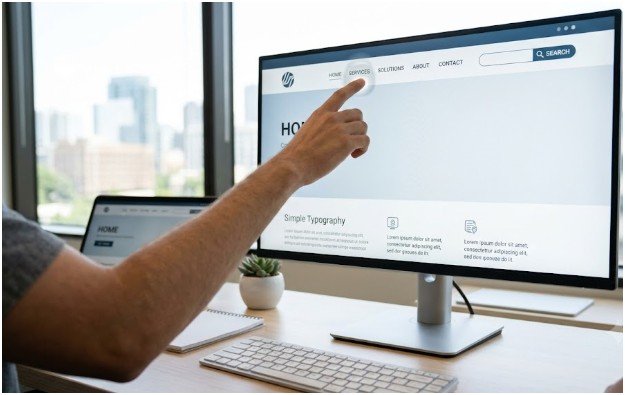
People should not need to learn your interface before using it. Familiar patterns make how to improve website usability for first-time visitors a practical design task rather than a visual guessing game.
Reduce Choices Without Hiding Essential Pages
Keep the main menu focused on important sections. Seven links can be a useful ceiling, but clarity matters more than following a rigid number.
Use labels such as Services, Pricing, Resources, About, and Contact. Avoid branded terms that need explanation. Place navigation where people expect it, and ensure the logo links to the homepage.
A visible search field helps content-heavy websites. It gives visitors a direct route to products, articles, services, or support information.
Make Content Easy to Scan
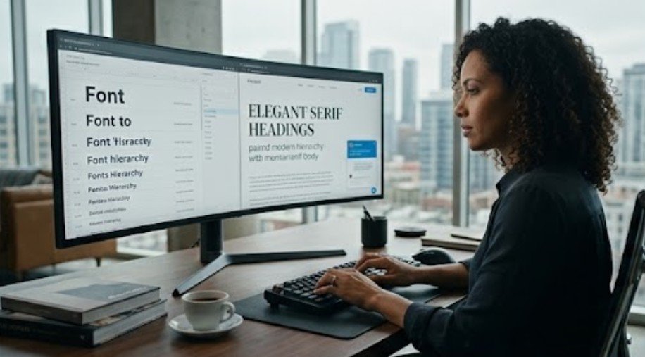
Use descriptive headings, short paragraphs, clear link text, and limited bold emphasis. A heading should explain what readers will find beneath it.
Do not bury essential information inside rotating sliders, hidden tabs, or decorative graphics. Important content should remain visible and easy to access on smaller screens.
Improve Mobile Usability and Technical Performance

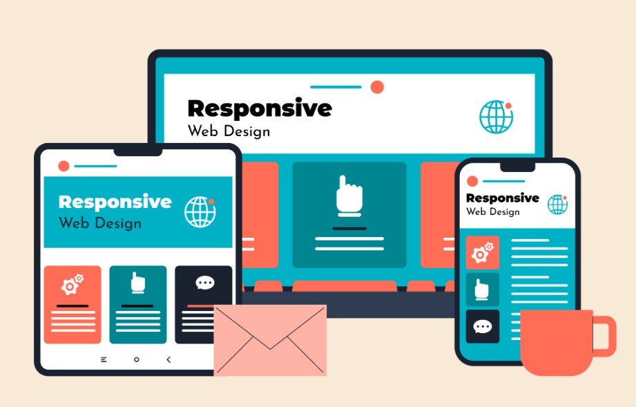
A polished desktop page can still frustrate a mobile visitor. Google recommends making equivalent content and resources available on mobile because it uses mobile-first indexing.
Ensure Responsiveness, Not Just Load Time
Google’s Core Web Vitals targets are an LCP within 2.5 seconds, an INP of 200 milliseconds or less, and a CLS score of 0.1 or less. Google recommends evaluating these measurements at the 75th percentile of visits.
Avoid oversized images, unused scripts, and heavy third-party widgets. Reserve media space so page content does not jump while images, advertisements, or banners load.
Page experience supports usability, but perfect technical scores cannot guarantee strong rankings. Google considers content quality and other signals alongside technical performance.
Check the Complete Mobile Journey
Test menus, forms, search tools, checkout pages, and confirmation screens. Remove horizontal scrolling and prevent sticky banners from covering buttons or form controls.
Buttons should be comfortable to tap. Text should remain readable without zooming. Navigation should work with touch, keyboard input, and assistive technologies.
Avoid displaying an immediate full-screen pop-up. Let visitors understand the page before requesting an email address, account registration, or app installation.
Remove Friction From Forms, CTAs, and Checkout

Conversions often fail because a website asks for too much, too soon. Simplifying the final action is central to how to improve website usability for first-time visitors.
Ask Only for Information You Need Now
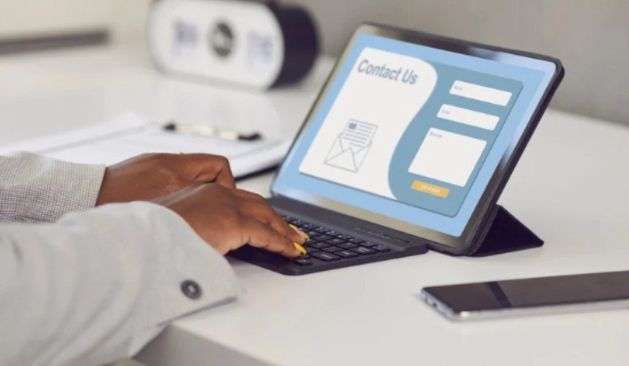
Ask only for details required to complete the current step. A newsletter form rarely needs a phone number, company name, job title, and mailing address.
Label every field visibly. Do not use placeholder text as the only instruction because it disappears when the visitor begins typing. W3C guidance recommends explicit labels and understandable instructions for form controls. Specific error messages. “Enter a five-digit ZIP code” provides more help than “Invalid entry.” Preserve completed fields when an error occurs.
Make the Next Action Unmistakable
Use one primary CTA style throughout the website. Write labels that describe the result, such as “See Pricing,” “Get My Estimate,” or “Reserve My Appointment.”
Check color contrast before approving brand colors. WCAG 2.2 sets a minimum contrast ratio of 4.5:1 for standard-sized text. Commerce websites offer guest checkout. Request account creation after the purchase, when customers can understand its benefits.
Use My First-Visit Friction Score
I recommend a simple framework that turns vague feedback into an actionable score. Give an unfamiliar tester five realistic tasks:
- Explain what the website offers.
- Find a core service or product.
- Locate pricing or the next-best option.
- Complete the main form or checkout path.
- Return to the homepage.
Award one point for each task completed without assistance within 30 seconds. A score below four signals serious first-visit friction.
Apply the Score to a Worked Example
Imagine a dental homepage with a rotating hero image, six equal buttons, and a hidden booking link. A tester cannot find insurance details or schedule an appointment quickly, so the page scores two points.
Replace the slider with a direct heading: “Family and Emergency Dentistry in Austin.” Add “Book an Appointment” as the primary CTA. Move Insurance into the main navigation.
The redesign does not need more features. It needs clearer priorities.
This method makes how to improve website usability for first-time visitors measurable. It also helps teams prioritize failed tasks instead of debating personal design preferences.
Your Website Is Not an Escape Room
Good usability feels obvious because the difficult decisions happened before the visitor arrived. Clarify the offer, reduce unnecessary choices, improve interaction speed, label controls, and simplify the next step.
To apply how to improve website usability for first-time visitors, test one important page with someone unfamiliar with your brand. Watch silently while they complete a realistic task.
Fix the first place they hesitate before redesigning anything else. That moment of uncertainty usually reveals more than another round of internal opinions.
Frequently Asked Questions
1. How can I improve homepage usability for new visitors?
State the offer clearly, simplify navigation, show one main CTA, and remove unnecessary distractions above the fold.
2. What makes a website easy to use on mobile?
Responsive layouts, readable text, stable content, fast interactions, comfortable tap targets, and simple forms improve mobile usability.
3. How do I test first-time visitor usability?
Give unfamiliar users realistic tasks, observe where they hesitate, and record completion times without guiding them.
4. Why do first-time visitors leave a website quickly?
Visitors may leave when pages feel slow, hide their purpose, create navigation confusion, or demand commitment too early.